Why using Bulma as a CSS Framework?
Creating a quality web interface isn't easy. You need a cohesive design, an understandable user experience, well-structured HTML, memorable class names, and well-organized style sheets.
Now all of this is going to take time and can be very tedious and there are a lot of ways that it can go wrong and a poor user interface can lead to poor user adoption. Now there's a solution to all of this, a CSS framework, a library of pre-built UI components with web standards and best practices built right in.
But if you are looking to save time and energy, not all CSS frameworks are going to be created equally. Some are going to be less well-documented, take a longer time to learn, and be tougher to use. Fortunately there's Bulma, a CSS framework that's simple to learn and simple to use.
Let's take a look at some of the key reasons why working with Bulma is so great.
Elements & Components
Bulma comes packaged with beautiful UI components. These include the nav bar, tabs, panel, box and media object, drop-down, card, form, progress bar, and pagination, and many more. These components work together to give your web interface a cohesive design. Because Bulma is built with SAS, it is very modular. Just import the features that you need and you're ready to go.
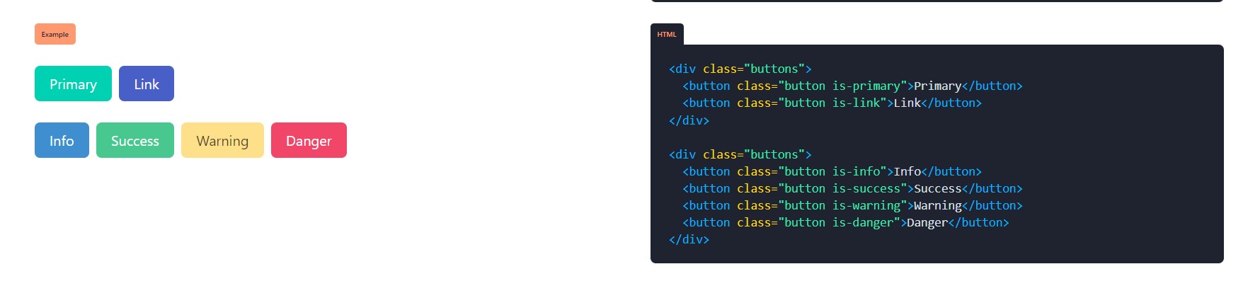
Classes and Modifiers
Bulma's class names are highly readable. If you want a button, just add the button class name. Bulma's syntax for adding modifiers is simple. Want your button to be large? Just add the .isLarge modifier class. Want the button to be large and the primary color of your design? Just add .isPrimary.
Grids and Columns
Since Bulma is built on Flexbox, it makes tasks like creating grids and vertical alignment a breeze. Let's take a look at columns. We'll make a parent div with the columns class name. We'll put four divs within it with the column class name. They'll automatically be vertically aligned. Right now we're looking at a mobile view, but if we were to switch to a wider viewport, each column will align horizontally into its respective quarter of the column's container. As you can see, Bulma is built to be fully responsive. If we remove this fourth column, the remaining columns will scale to fit into thirds of their parent container.
There are plenty more reasons to use Bulma, and if you want to try it out, you can head over to Bulma.io to check out their documentation.